[:es]
Diagrama o gráfico de control: herramienta control de procesos
Os presento otra de las consideradas las 7 herramientas de la Calidad. El Diagrama o gráfico de control sirve como herramienta de control de los procesos. Esta herramienta es ampliamente utilizada, y nos sirve para evaluar de una forma visual, la estabilidad del proceso, así como para identificar aquellos valores que se salen del rango de confianza del sistema.
En este artículo os explico detalladamente ¿En qué consiste gráfico o diagrama de control? ¿Cómo es? ¿Qué aspecto tiene? ¿Para qué sirven las gráficas de control? ¿Cómo puedo realizar estas gráficas? ¿Qué fuentes de variación tenemos en un proceso? Que tipos de gráficas de control existen? ¿Qué nos aporta el diagrama de control a nuestros sistema de gestión de calidad iso9001:2015? Y para finalizar un ejemplo sencillo, en Excel, para el control del proceso.
¿En qué consiste gráfico o diagrama de control?
Fue creado por Walter Andrew Shewhart en 1920, el diagrama o gráfico de control, también conocido como diagrama de Shewhart, carta de control o diagrama de comportamiento de proceso, es una de las 7 herramientas de calidaddefinidas por Ishikawa.
GRAFICOS DE CONTROL
Una gráfica de control es un diagrama que sirve para examinar si un proceso se encuentra en una condición estable, o para asegurar que se mantenga en esa condición.
Nos permite conocer, de una manera gráfica, si todos los puntos de nuestra muestra, están dentro de un determinado rango.
En estadística, se dice que un proceso es estable (o está en control) cuando las únicas causas de variación presentes son las de tipo aleatorio. Para estos casos, se pueden hacer inferencias con respecto a la salida del proceso, esto es, la característica de calidad que se esté midiendo. En cambio, la presencia de causas especiales o asignables hace que el proceso se desestabilice, impidiendo la predicción de su comportamiento futuro.
En base a la información obtenida en intervalos determinados de tiempo, las gráficas de control definen un intervalo de confianza: Si un proceso es estable, el 95% de las veces el resultado se mantendrá dentro de ese intervalo.
¿Cómo es? ¿Qué aspecto tiene?
La estructura de las gráficas contiene:
– Una “línea central” (LC) que representa la media de los valores
– Una línea superior que marca el “límite superior de control” (LCS), que se considera la media más
– Una línea inferior que marca el “límite inferior de control” (LCI) que representa la media menos
– Finalmente, se representan los puntos puntos que contienen información sobre las lecturas hechas; pueden ser promedios de grupos de lecturas, o sus rangos, o bien las lecturas individuales mismas.
Los límites de control marcan el intervalo de confianza en el cual se espera que caigan los puntos.
El gráfico tiene el siguiente aspecto:
¿Para qué sirven las gráficas de control?
Las gráficas de control sirven para:
– Determinar el estado de control de un proceso.
– Diagnosticar el comportamiento de un proceso en el tiempo.
– Indicar si un proceso ha mejorado o ha empeorado.
– Permite identificar las dos fuentes de variación de un proceso
– Sirve como una herramienta de detección de problemas.
¿Cómo puedo realizar estas gráficas?
Habitualmente, en las empresas en que el uso de las gráficas de control esta generalizada, se utiliza software estadístico adaptado a las necesidades de la empresa. Existen en el mercado numerosos programas informáticos que te permiten realizar este tipo de gráficos, entre otros, de una forma automatizada.
Pero, también es habitual encontrar a personas que realizan sus gráficas de control en el programa informático Excel.
¿Qué fuentes de variación tenemos en un proceso?
Las fuentes de Variación en un Proceso son las atribuibles a las causas asignables o a las causas comunes:
1. Causas Asignables o Especiales
Son los factores esporádicos que desestabilizan el sistema. Su identificación es inmediata y fácil.
2. Causas Comunes o Naturales
Son los factores que afectan en poco la variabilidad del sistema.
Su presencia es aleatoria y no son de fácil detección.
Generalmente están relacionadas con aspectos administrativos.
¿Cómo empezamos a realizar una gráfica de control?
Antes de establecer una gráfica de control es necesario definir con claridad los siguientes puntos:
1) el objetivo de la gráfica: para qué hacemos este gráfico.
2) el aspecto que se va a considerar: qué queremos controlar, qué proceso debemos controlar, qué característica se va a medir, quizá longitud, quizá número de defectos, el volumen…
3) la unidad de donde se va a tomar la muestra: dónde se va a tomar la muestra.
4) Determinar qué tipo de gráfico se debe realizar
5) Determina el tiempo en el que estarás capturando los datos y define con base en el tipo de gráfico que vas a trazar, cuestiones como la cantidad de muestras a considerar (considera al menos 20) y el tamaño de cada una.
6) Recopila los datos
7) Calcula la media de los valores y el rango (Límite superior e inferior)
8) Representa la gráfica
9) Analiza el resultado de los datos obtenidos.
¿Qué tipos de gráficas de control existen?
Existen numerosos criterios para realizar un diagrama de control, en este artículo os mostraré, la forma más común, pero deberéis aplicar aquella que mejor controle vuestro proceso. La forma más habitual es calcular la media, y los límites de calculan considerando 3 veces la desviación estándar, lo veréis en el ejemplo que os pondré más adelante.
Podemos tener gráficas de control de variables o bien control de atributos:1. Gráficas de Control de Variables:
La característica de calidad que se mide es una variable continúa (Masa, Longitud, Temperatura, fuerza…). Si ese es el caso, podemos encontrar gráficos en base a la media (

) y el rango.
– Gráfica
– R Promedios y rangos
– Gráfica
– s Promedios y Desviación Estándar
– Gráfica
– R Medianas y Rangos
– Gráfica
– R Lecturas Individuales y Rangos
2. Gráficas de Control por Atributos:
Piensa en una característica de calidad basada en atributos como el cumplimiento con respecto a un requisito. Lo hacemos con variables discretas. De aquí se derivan cuatro tipos de gráficos:
– Gráfica p Porcentaje de unidades o procesos defectuosos
– Gráfica np Número de unidades o procesos defectuosos
– Gráfica c Número de defectos por área de oportunidad
– Gráfica u Porcentaje de defectos por área de oportunidad
Las gráficas de control son comúnmente utilizadas para monitorear el control estadístico del proceso o SPC por sus siglas en ingles. Esta última herramienta, así como el APQP, PPAP, AMFE y MSApertenecen al grupo de herramientas conocidas como Core Tools del sector automotriz, que es un requerimiento del ISO/TS 16949.
Ejemplo en Excel
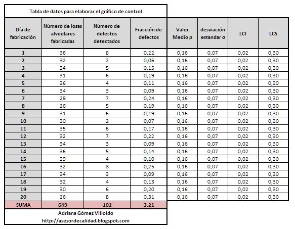
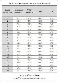
Nuestro ejemplo, se trata de una empresa, que fabrica elementos prefabricados de hormigón. Por ejemplo, vamos a controlar los defectos detectados en la fabricación de losas alveolares prefabricadas. En este caso, no vamos a distinguir por la tipo de defecto detectado. Anotaremos, por día de fabricación el número de defectos encontrados. Los resultados los podemos ver en la tabla siguiente:
*Los datos recogidos en esta tabla son inventados, a modo de ejemplo.
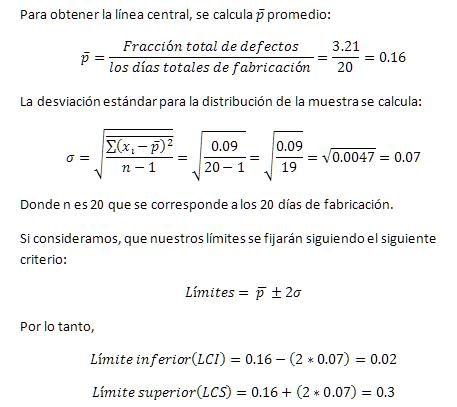
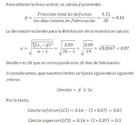
Una vez que disponemos de la tabla anterior, el primer cuadrante, donde hemos recogido todos los datos que queremos analizar, debemos a determinar la línea media y los límites inferior y superior. A continuación os explico cómo calcularlo:
Para ello, primero debemos calcular la media y la desviación estándar:
Para calcular la media de defectos por día se realiza dividiendo el número de defectos detectado entre el número total de días de fabricación:
Con todos los datos anteriores, debemos fijar los límites inferior y superior.
Habitualmente la empresa, o la persona que quiere controlar el proceso, es quien decide el criterio aplicar. Lo más común es que se fijen como la media mas/menos dos veces la desviación estándar, ya que aseguras que entren dentro del intervalo el 95.4% de los datos.
Los porcentajes serían:
La media +/- 1 vez la desviación estándar (68.3% de los datos)
La media +/- 2 veces la desviación estándar (95.4% de los datos)
la media +/- 3 veces la desviación estándar (99.7% de los datos)
En nuestro caso hemos considerado 2 veces la desviación estándar.
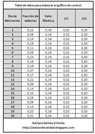
Con todos los datos anteriores, obtendremos la tabla con las siguientes columnas para elaborar el gráfico:
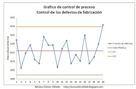
Una vez disponemos de la tabla anterior, seleccionamos todo el rango de datos, incluidos los títulos, insertamos un gráfico de líneas en Excel, y ya disponemos del gráfico de control, únicamente tendremos que retocar el diseño, añadiendo el título, ajustando colores y demás.
El gráfico con los datos anteriores sería de la siguiente forma:
En este caso, dispondríamos de todos los datos dentro del rango de un 95%, el único valor que saldría fuera del rango, es el último. Se tendría que analizar el porqué.
¿Qué nos aporta el diagrama de control a nuestros sistema de gestión de calidad ISO 9001:2015?
Uno de los requisitos de la norma ISO 9001:2015, es el control de los procesos, así como el análisis de los resultados de cada uno de ellos. Mediante esta herramienta podemos controlar y analizar de forma gráfica los diferentes procesos de la empresa.
Cuando hablamos de diagrama de control, pensamos únicamente que puede ser para el control de los procesos de producción o medición de alguna magnitud, pero también puede usarse para cualquier otro proceso. Os pondré un ejemplo, para el departamento de recursos humanos:
Una empresa, que dispone de 200 trabajadores, quiere controlarse, de una forma gráfica la formación de estos trabajadores. Se cuenta el número de cursos de formación que ha impartido la empresa para capacitar a sus trabajadores, por cada uno de ellos. Se establece la media, y se determina el rango superior e inferior. Se representan los datos, y se observa el gráfico qué trabajadores salen del rango inferior y el del superior. A veces cuando tratamos con valores grandes (como 200 trabajadores), es difícil hacer una visión general de la situación que se tiene, y qué medidas o decisiones tomar al respecto.
[:en]
Diagram or control chart: process control tool
I present another of the considered the 7 tools of Quality. The Diagram or control graph serves as a process control tool. This tool is widely used, and it helps us to evaluate in a visual way, the stability of the process, as well as to identify those values that emerge from the system’s confidence range.
In this article I explain in detail what is the graph or control diagram? How is it What aspect do you have? What are the control charts for? How can I make these graphs? What sources of variation do we have in a process? What types of control charts exist? What does the control diagram give us to our ISO 9001: 2015 quality management system? And to finish a simple example, in Excel, to control the process.
What is a graphic or control diagram?
It was created by Walter Andrew Shewhart in 1920, the chart or control chart, also known as Shewhart diagram, control chart or process behavior diagram, is one of the 7 quality tools defined by Ishikawa.
A control chart is a diagram that is used to examine whether a process is in a stable condition, or to ensure that it is maintained in that condition.
It allows us to know, in a graphic way, if all the points in our sample are within a certain range.
In statistics, it is said that a process is stable (or is in control) when the only causes of variation present are those of a random type. For these cases, inferences can be made regarding the output of the process, that is, the quality characteristic that is being measured. Instead, the presence of special or assignable causes causes the process to destabilize, preventing the prediction of its future behavior.
Based on the information obtained at certain time intervals, the control charts define a confidence interval: If a process is stable, 95% of the time the result will remain within that range.
How is it What aspect do you have?
The structure of the graphs contains:
– A «central line» (LC) that represents the average values
– A top line that marks the «upper limit of control» (LCS), which is considered the most average
– A lower line that marks the «lower limit of control» (LCI) that represents the mean less
– Finally, the points points that contain information on the readings are represented; They can be average of groups of readings, or their ranks, or the individual readings themselves.
The control limits mark the interval of confidence in which the points are expected to fall.
The chart looks like this:

What are the control charts for?
The control charts serve to:
– Determine the state of control of a process.
– Diagnose the behavior of a process in time.
– Indicate whether a process has improved or has worsened.
– It allows to identify the two sources of variation of a process
– It serves as a tool for detecting problems.
How can I make these graphs?
Usually, in companies where the use of control charts is widespread, statistical software is adapted to the needs of the company. There are numerous computer programs in the market that allow you to perform this type of graphics, among others, in an automated way.
But, it is also common to find people who perform their control charts in the Excel software.
What sources of variation do we have in a process?
The sources of Variation in a Process are attributable to the attributable causes or the common causes:
1. Assignable or Special Causes
These are the sporadic factors that destabilize the system. Your identification is immediate and easy.
2. Common or Natural Causes
They are the factors that little affect the variability of the system.
Its presence is random and not easily detectable.
They are usually related to administrative aspects.
How do we begin to make a control chart?
Before establishing a control chart, you need to clearly define the following points:
1) the objective of the graph: what do we do about this graphic?
2) the aspect to be considered: what do we want to control, what process we must control, what characteristic to be measured, perhaps length, perhaps number of defects, the volume …
3) the unit from where the sample is to be taken: where the sample is to be taken.
4) Determine what type of graphic should be done
5) Determines the time in which you will be capturing the data and defining with baseline
in the type of graphic that you are going to trace, questions such as the quantity of samples to consider (consider at least 20) and the size of each.6) Compile the data7) Calculate the average values and the range (Upper limit E inferior) 8) Represents the graph9) Analyze the result of the data obtained. What types of control charts exist? There are numerous criteria for performing a control diagram, in this article I will show you, the most common way, but you must apply The one that best controls your process.
The most common way is to calculate the average, and the limits of calculate considering 3 times the standard deviation,
you will see it in the example that I will put to you later. We can have control graphs of variables or control of attributes: 1. Variable Control Charts: The quality characteristic that is measured is a continuous variable (Mass, Length,Temperature, Force …). If that is the case, we can find graphs based on the average () and the range.- Graph – R Averages and ranges- Graph – s Averages and Standard Deviation- Graph – R Mediums and Ranges- Graphics – R Individual Readings and Ranges2 . Attribute Control Charts: Think of an attribute-based quality feature such as compliance with a requirement. We do it with discrete variables. From this, four types of graphics are derived: – Graph p Percentage of defective units or processes – Graph np Number of defective units or processes – Graph c Number of defects per opportunity area – Graph u Percentage of defects per opportunity area Control graphs They are commonly used to monitor the statistical control of the process or SPC for its acronym in English.
This latest tool, as well as the APQP, PPAP, AMEF and MS, belong to the group of tools known as the Core Tools in the automotive sector, which is a requirement of ISO / TS 16949. Example in Excel Our example is a company that manufactures elements Prefabricated concrete For example, we are going to control the defects detected in the manufacture of prefabricated alveolar slabs. In this case, we will not distinguish by the type of detected defect. We will note, by day of manufacture, the number of defects found. The results can be seen in the following table: * The data collected in this table are invented, by way of example. Once we have the table above, the first quadrant, where we have collected all the data we want to analyze, we must Determine the middle line and the lower and upper limits. Next I explain how to calculate it: To do this, we must first calculate the mean and the standard deviation: To calculate the mean defects per day, it is done by dividing the number of defects detected between the total number of manufacturing days: With all the previous data , We must set the lower and upper limits. Usually the company, or the person who wants to control the process, is the one who decides the criterion to apply. The most common thing is that they are set as the average more / minus twice the standard deviation, since you ensure that 95.4% of the data enter within the range.
The percentages would be:
The mean +/- 1 time the standard deviation (68.3% of the data)
The average +/- 2 times the standard deviation (95.4% of the data)
the average +/- 3 times the standard deviation (99.7 % Of the data)
In our case we have considered the standard deviation twice. With all the previous data, we will obtain the table with the following columns to prepare the graph: Once we have the table above, we select the entire range of data, included The titles, we insert a chart of lines in Excel,
and we already have the control chart, we will only have to tweak the design, adding the title, adjusting colors and so on. The graph with the previous data would be as follows: In this case, we would have all the data within the range of 95%, the only value that would be out of range, is the last. It would be necessary to analyze why.
What gives the control chart to our ISO 9001: 2015 quality management system?
One of the requirements of the ISO 9001: 2015 standard is the control of the processes, as well as the analysis Of the results of each one of them. Through this tool we can control and analyze graphically the different processes of the company. When we talk about control diagram, we think only that it can be for the control of production processes or measurement of some magnitude, but it can also be used for any other process. I will give you an example, for the human resources department: A company, which has 200 workers, wants to control, in a graphic way, the training of these workers. The number of training courses taught by the company to train their workers, for each one, is counted. The average is established, and its range is determined[:]